Tigers' Old Road Threads So Simple, So Grand
They were flannel, of course -- these were the days before double knits were all the rage. And they were remarkably plain and simple. Kind of like the Penn State football duds. I thought they were rather boring when I was a child, but I find myself longing for them now.
They were the Tigers' old road uniforms -- and when I say old, I mean the style that was worn in the 1960s and early-1970s. The 2006 Tigers wore them in Seattle last year for a Turn Back the Clock Game, but in case you missed that, here's what I'm talking about:

That's good old Mickey Stanley modeling the uniform for you.
It's lovely, isn't it? Plain block DETROIT on the front. Light grey. A number on the shoulder (actually, I think the latest version had numbers on both shoulders. Looks like the number is only on the right shoulder in this pic). The back had the number in dark blue, with no edge or drop shadow. In 1970, all MLB teams (save a few, like the Yankees, Red Sox, and Cubs) sewed names on the backs of the jerseys. I can live with the names. And with this uniform, the players' names were in the same block, no-frills style as the DETROIT on the front.
The pants had no piping down the sides of the legs, that I can recall, and while searching for images on Google, I saw none. Just plain grey.
Be still my heart.
I think my infatuation stems from the fact that whenever I think of those uniforms, I'm taken back to my childhood -- a much simpler time. Plus I've been listening in my car a lot to an old audio cassette a co-worker made for me years ago of the classic album, "Year of the Tiger," which features actual game audio of radio men Ernie Harwell and Ray Lane describing the thrills of 1968 as they originally broadcast them. So I think listening to that is making me long for the old road threads, too.
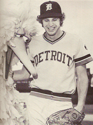
The plain greys were the road unis that the Tigers wore for the entire decade of the 1960s, and until midway thru 1972, when they changed during midseason (which was odd, come to think of it) to this version:

By the way, Mark Fidrych is on the right in this photo.
Note the thick "D" on Fidrych's cap. It was orange with a white drop shadow. For the 1982 season, the "D" lost its drop shadow and became the plain orange that the team still wears today, on the road caps.
Yes, I know way too much about uniforms throughout history. I admit it.
Anyhow, the above version that Fidrych is wearing served the Tigers thru the glory days of 1984, all the way until 1994, when the team switched to a similar version of today's road uniforms. Those had ridiculous shoulder stripes that continued down the sides of the leg. That was scrapped after a couple of years to the current version. Also, the Tigers briefly used this logo on their road caps:

Remember?
The home uniforms have remained basically unchanged -- the creamy whites of Greenberg and Gehringer in the 1930s and 1940s are practically the same as the ones of Inge and Bonderman today. And I love that, too.
So there you have it. I think the Tigers should change back to the 1960s' road duds -- at least for more than just one game per year. Maybe they could wear them on Sundays away from Detroit.
Whaddya think?
They were the Tigers' old road uniforms -- and when I say old, I mean the style that was worn in the 1960s and early-1970s. The 2006 Tigers wore them in Seattle last year for a Turn Back the Clock Game, but in case you missed that, here's what I'm talking about:

That's good old Mickey Stanley modeling the uniform for you.
It's lovely, isn't it? Plain block DETROIT on the front. Light grey. A number on the shoulder (actually, I think the latest version had numbers on both shoulders. Looks like the number is only on the right shoulder in this pic). The back had the number in dark blue, with no edge or drop shadow. In 1970, all MLB teams (save a few, like the Yankees, Red Sox, and Cubs) sewed names on the backs of the jerseys. I can live with the names. And with this uniform, the players' names were in the same block, no-frills style as the DETROIT on the front.
The pants had no piping down the sides of the legs, that I can recall, and while searching for images on Google, I saw none. Just plain grey.
Be still my heart.
I think my infatuation stems from the fact that whenever I think of those uniforms, I'm taken back to my childhood -- a much simpler time. Plus I've been listening in my car a lot to an old audio cassette a co-worker made for me years ago of the classic album, "Year of the Tiger," which features actual game audio of radio men Ernie Harwell and Ray Lane describing the thrills of 1968 as they originally broadcast them. So I think listening to that is making me long for the old road threads, too.
The plain greys were the road unis that the Tigers wore for the entire decade of the 1960s, and until midway thru 1972, when they changed during midseason (which was odd, come to think of it) to this version:

By the way, Mark Fidrych is on the right in this photo.
Note the thick "D" on Fidrych's cap. It was orange with a white drop shadow. For the 1982 season, the "D" lost its drop shadow and became the plain orange that the team still wears today, on the road caps.
Yes, I know way too much about uniforms throughout history. I admit it.
Anyhow, the above version that Fidrych is wearing served the Tigers thru the glory days of 1984, all the way until 1994, when the team switched to a similar version of today's road uniforms. Those had ridiculous shoulder stripes that continued down the sides of the leg. That was scrapped after a couple of years to the current version. Also, the Tigers briefly used this logo on their road caps:

Remember?
The home uniforms have remained basically unchanged -- the creamy whites of Greenberg and Gehringer in the 1930s and 1940s are practically the same as the ones of Inge and Bonderman today. And I love that, too.
So there you have it. I think the Tigers should change back to the 1960s' road duds -- at least for more than just one game per year. Maybe they could wear them on Sundays away from Detroit.
Whaddya think?


 Proud Member of DIBS

0 Comments:
Post a Comment
<< Home